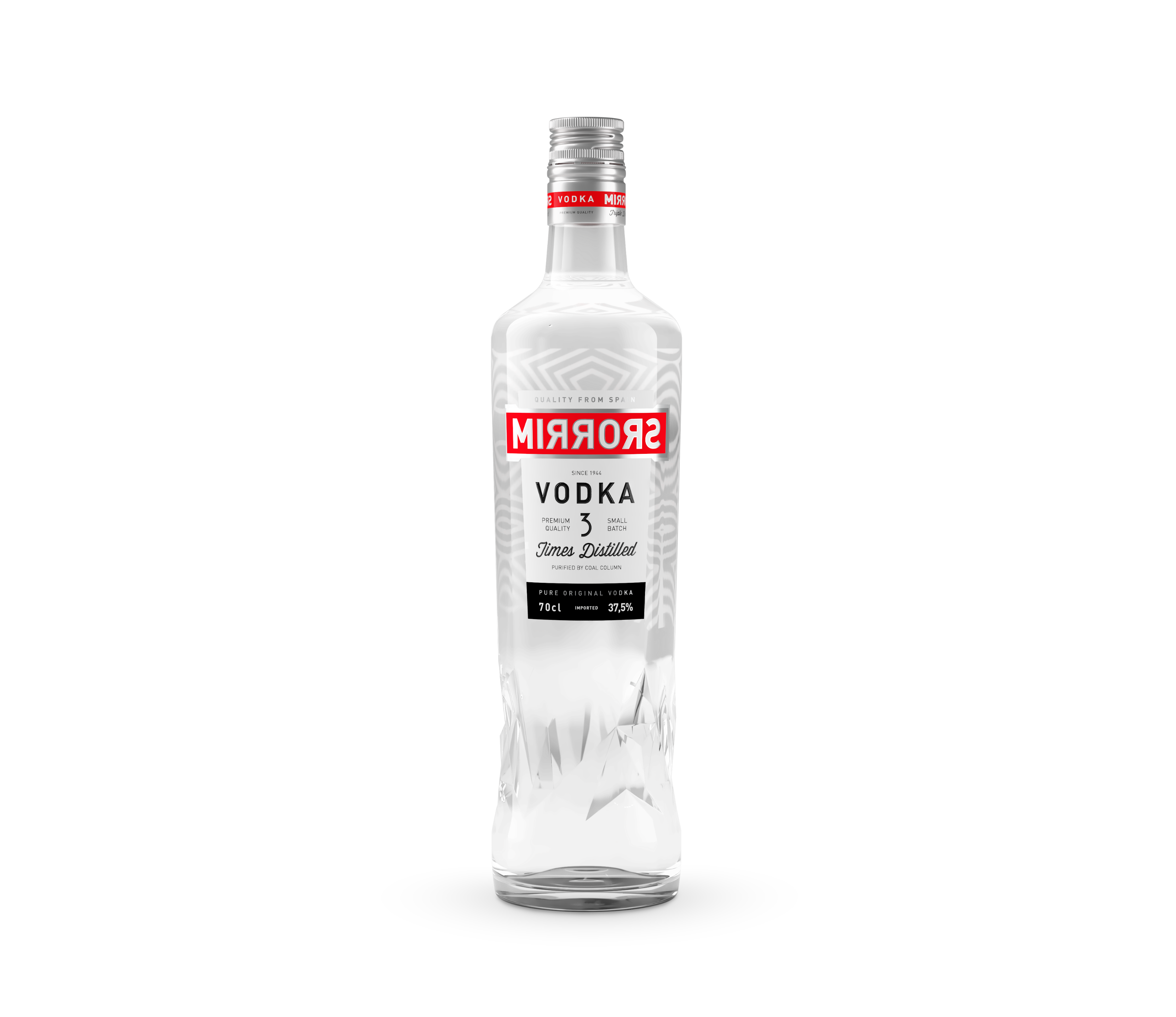

One of the starting conditions present in the redesign of this brand was to maintain a “very vodka” style, something that we achieved thanks to the use of geometric shapes and the red band. In addition, the inverted “R” letters not only respond to the relationship with the concept of “mirror”, but also correspond to letters of the Russian alphabet.

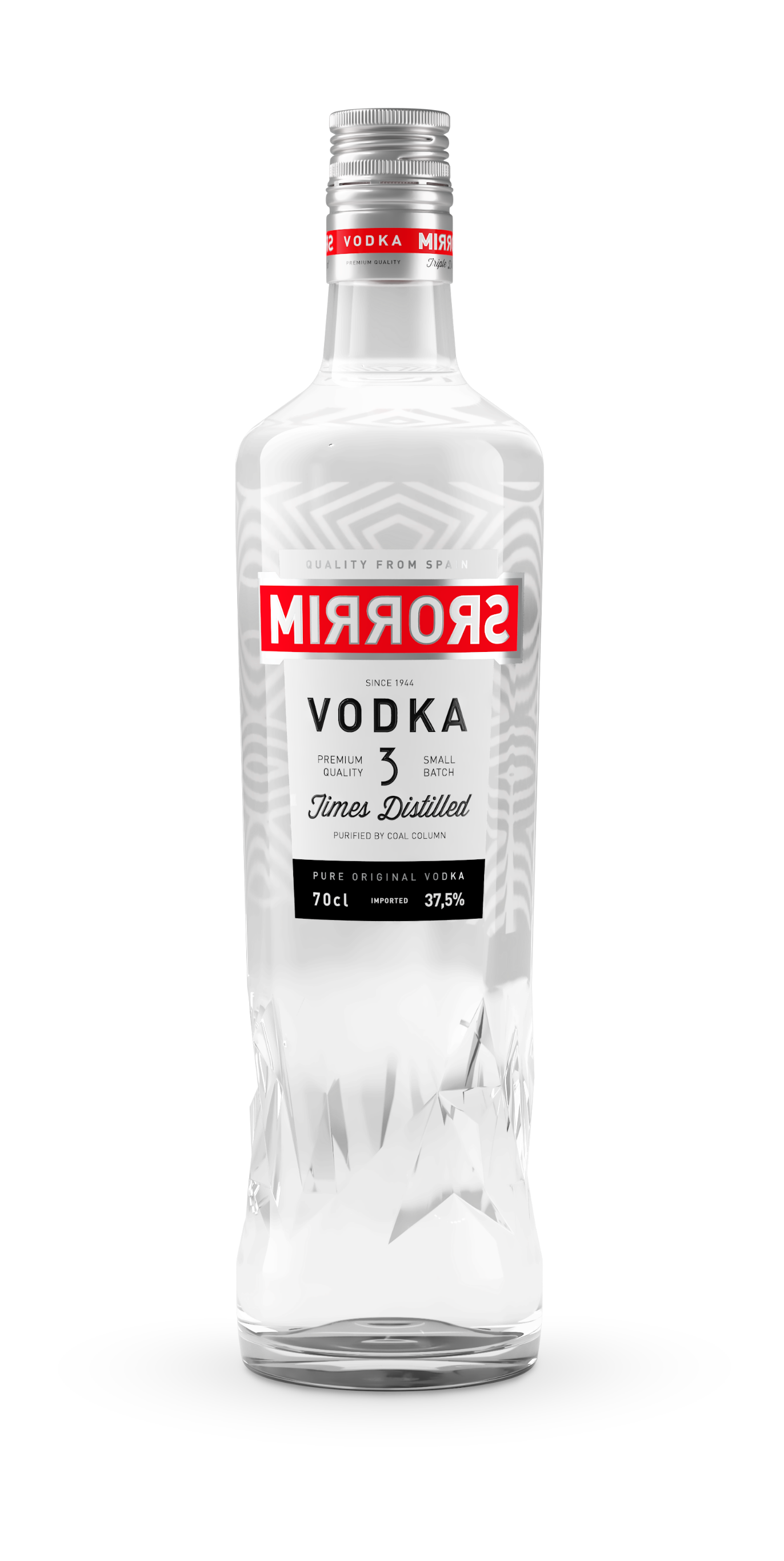
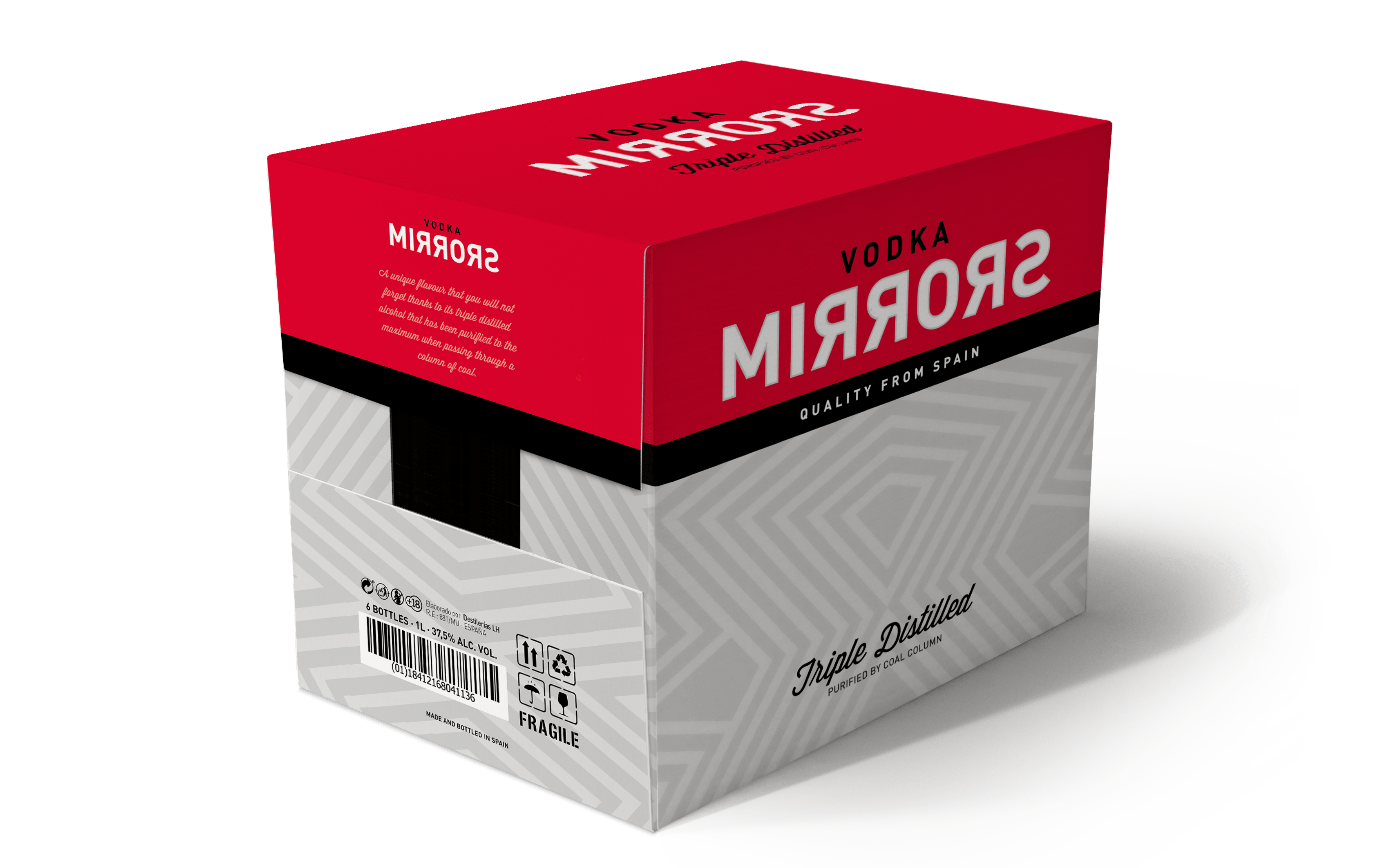
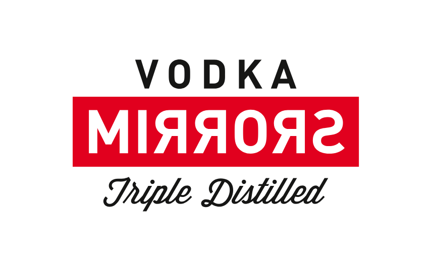
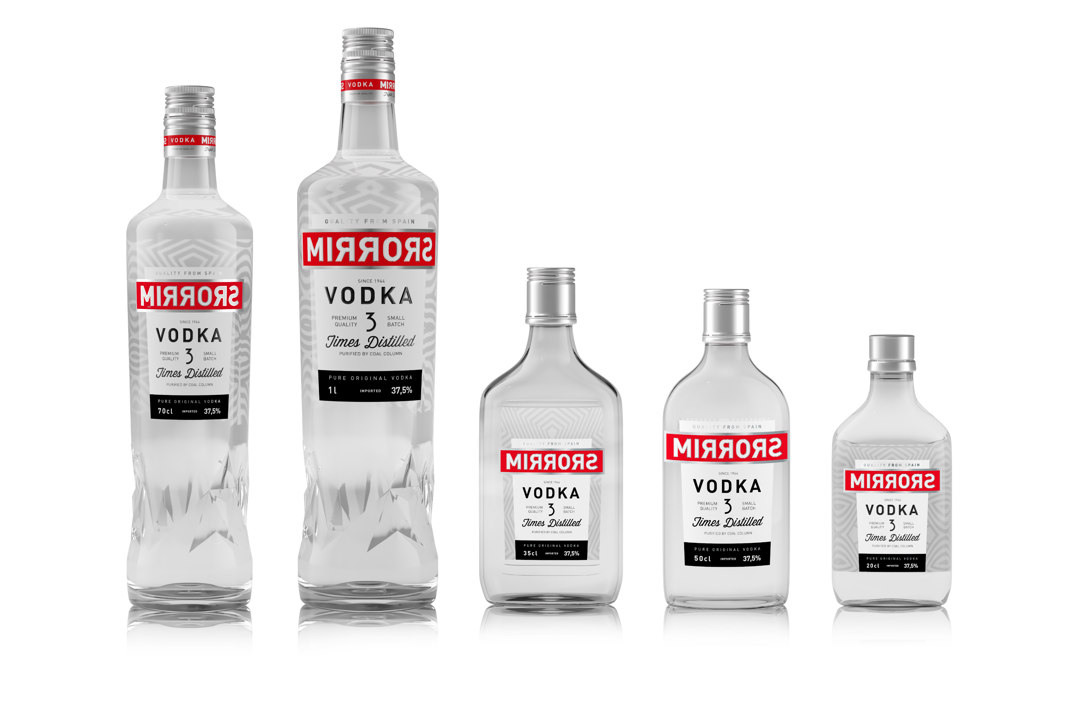
One of the starting conditions present in the redesign of this brand was to maintain a “very vodka” style, something that we achieved thanks to the use of geometric shapes and the red band. In addition, the inverted “R” letters not only respond to the relationship with the concept of “mirror”, but also correspond to letters of the Russian alphabet.
